4.30.2015

Throwback Thursday // Crate Paper

Quickly stopping in with an old post featuring a decorated wooden piece from Michaels. My thoughts below, from around June 2013;

I've decorated a couple wooden shapes so far, some even being published, but this cutie is by far my favorite. I don't think she's for everyone though, because while my mom and one of my sisters loved her, my younger sister thought she was "creepy". Oh well, you can't please everyone. ;)


Despite her dislike of the owl, my sister recommended I add some white feathers for a little bit of down.


Completed this little one while watching the entire North and South miniseries as part of a 'girls night' - has anyone else seen this series? I really enjoyed it, though I'll admit, sometimes the main female character got on my nerves. ;)

********************************
Patterned paper: Crate Paper "Story Teller"
Other: gems and wooden shape (Michaels)

4.29.2015

Shaker card // Lawn Fawn

Things were getting a little too girly around here again, so here I am with no-frills card to shake things up! (sorry, that was awful ;))
This card is for this weeks Simon Says Stamp Wednesday challenge (anything goes) and for the SSS Monday challenge (anything goes) as well.


This is one of the first shaker cards I've ever done - if I could change anything, I'd do something about those clouds hidden behind the vellum pocket, but for a simple little baby card, I left it as is.

I finished my last class of the semester today, and I am officially a senior! Wohoo! If you know of any cardmaking/papercrafting/craft companies that have some kind of summer internship, let me know, because I'm looking high and low for a cool place to put my design skills to work!

Thanks for stopping in and God bless!

*******************************************


Supplies not shown
Cardstock: Canson
Other: vellum

4.27.2015

Doubled Vellum // Papertrey Ink

Hello there!
I'm here with a card for Simon Says Stamp clean and simple challenge, as well as this weeks Papertrey Ink Make It Monday using vellum to soften challenge.


Vellum is such a pretty thing to add to a card! Depending on the weight/thickness of your vellum, you can get slightly different looks.
I added it on this card because I couldn't figure out where else to place my sentiment (I'm not one for planning ahead). However, because my vellum was of a thinner weight, I had to use two layers of vellum so that the sentiment was able to pop out enough.
If I wanted a softer look, and didn't have to worry about my sentiment standing out enough, I would've used one layer.

Thanks for stopping and have a blessed day!

**************************************
Cardstock: Canson
Stamps: Papertrey Ink "Life is Sweet" and "Wet Paint I"
Ink: Hero Arts, Tim Holtz, Papertrey Ink
Other: vellum, gold embossing powder

Tools: heat gun, Cuttlebug, My Favorite Things "Framed Greetings" die

4.25.2015

Papertrey Ink April Blog Hop challenge

Hello everyon! Before my day starts to get really crazy, I just wanted to stop in with a card for this month's Papertrey Ink blog hop challenge.


I love navy and pink together, so this challenge was super fun for me...


I was inspired by a card I saw a couple weeks back - I can't remember where right now, but if I do, I'll link to it.
UPDATE: I found the card - HERE it is.
The card had a couple buildings, and the tops of some of those buildings cut, so it's pretty obvious where my inspiration came from. ;)


I'm considering doing another version of this card, with different colors and more watercolorey.


I didn't use the second step stamp on all of the buidlings from City Scene, just to give it a retro vibe.

That's it for me today - thanks so much for stopping in and enjoy the hop!

******************************************
Cardstock: Canson
Stamps: Papertrey Ink "City Scene", Simon Says Stamp "Sending and Wishing"
Ink: Tim Holz, Studio Calico

Tools: Cuttlebug, Simon Says Stamp "Wishing" die

4.23.2015

Papertrey Ink // Throwback Thursday

Taking a quick study break for a Throwback Thursday post - this post is circa June 2013.
My thoughts from then:

The bottom border is from the watercolor cardstock pad, that I just trimmed down.


You don't even know how "hip" I felt after making this card.
But for reals.

************************************
Cardstock: Strathamore, Core-dinations
Stamps: Papertrey Ink "Mehndi Medallions" and "For the Graduate" 
Ink: Papetrey Ink, Stazon
Other: gems (Joann Fabrics)

4.21.2015

Quilling // Lawn Fawn

I decided the blog was getting overwhelmed with girly cards again, so here's a masculine/gender neutral card to spice things up a bit.

This card was published in one of the last issues of Paper Crafts & Scrapbooking...*sigh* I miss that magazine.


No joke, I pulled this quilled frog from my scraps basket, and I made it at least, oh, six years ago! I had a little thing for quilling for a while when someone gifted me a Klutz quilling how-to book, but I eventually found it too time intensive for my style of cardmaking.
I can spend hours playing around with the arrangement of items on my cards, but I don't care to spend too much time on individual items, thus I don't involve myself with Copics or fancy coloring shtuff.


Quilling this frog was pretty simple though. I don't know all the technical terms, but the frog's head is just a tight circle, and the other pieces of his body are loose circles pinched in simple, various ways. Add a little smile with a marker, then attach some googley eyes, and there's you have your frog!

Thanks for stopping in and God bless!

*****************************************


Supplies not shown
Quilling tools/design/paper: Klutz
Other: googley eyes (stash), vellum (Joann Fabrics)

4.17.2015

Vellum Sentiment // Mama Elephant

Hello! I'm popping in with a just because card - just because!


This is one of those cards where I start layering, and when I'm almost finished, I realize I didn't plan for the sentiment. Ooops!
I wanted to make sure the sentiment stood out among the busy card, but the only place there was room was on the patterned paper, and I was worried the navy ink would get lost in the stripes.


The solution? Stamp it on vellum, cut it out, and add it on! You could cut right up to the sentiment, like I did HERE, or you could cut a shape around it, die cutting or just with your paper trimmer, which is what I did here.


I love using up my embellishments! Unlike stamps, which you can use over and over again, embellishments are a one-time thing, so I always feel the need to give them that one-time shot, their chance at GLORY!
Don't ask me why my brain works like this.

Thanks for popping in and have a great weekend!

**********************************************


Supplies not shown
Cardstock: Michaels
Embellishments: polaroid wood veneer (Michaels), cabochon (Ebay), vellum (JoAnn Fabrics), enamel dots (My Minds Eye)

4.15.2015

Stamped Focal Background // WPlus9

Happy hump day!
Just popping in with a quick and bright card for the Simon Says Stamp Wednesday challenge (create your own background) and for the Simon Says Stamp Monday challenge (in the middle)


To make sure the area behind the sentiment was white, I did some simple masking of the flowers. You could skip the masking and just cut a piece of cardstock to go behind it, but I wanted to be more techniquey. ;)

Thanks for stopping in and God bless!

*******************************************


4.13.2015

Layering layered images // Altenew

Hot dawg.
This card was a frustrating one to make and photograph.
Ah well, I've put my behind in the past.

Er, I've put my past behind me. ;)


I played along with the Altenew From Places Abroad challenge photo as inspiration, so I started out by stamping a TON of Vintage Roses flowers in reds and blues. Then I cut out the flowers (which was a nice, mindless thing to do - and I do love being mindless) and started arranging them. Which is where all the trouble started.


I had the darndest time trying to make the colors work without being overwhelming, and then layering them all together. I ended up ditching the reds because they looked a little too dramatic with the blue, which made layering the flowers a lot easier but still a bit of a challenge.


I finally managed to get everything to work semi-cohesively, after a few nights struggle with the problem. I thought it'd be fun to show you a bit of the "evolution" of the card. ;)


Of course, there is still the problem of the gold embossing not matching the gold glitter leaves, but at this point, I am just happy to call it a day. Or a card. Whatever.

Thanks so much for stopping in and God bless!

***********************************


Supplies not shown:
Paper: vellum (Darice), cardstock (Canson)
Ink: Studio Calico Color Theory
Die: Papertrey Ink "Life is Sweet" die and woodgrain impression plate

4.12.2015

Layering cards // Avery Elle

I'm a guest over at Virginia's View challenge!


This month's challenge is layers and dimensions, and for me, layering cards are a bit like piecing together a puzzle.
I love pulling random elements lying around on my desk (pros of being a messy crafter!) and making them all work on one 4 1/4 x 5 1/2 inch canvas.
Sometimes I'll begin by pulling those random pieces together, and sometimes I like to make a focal point, and arrange everything around it.
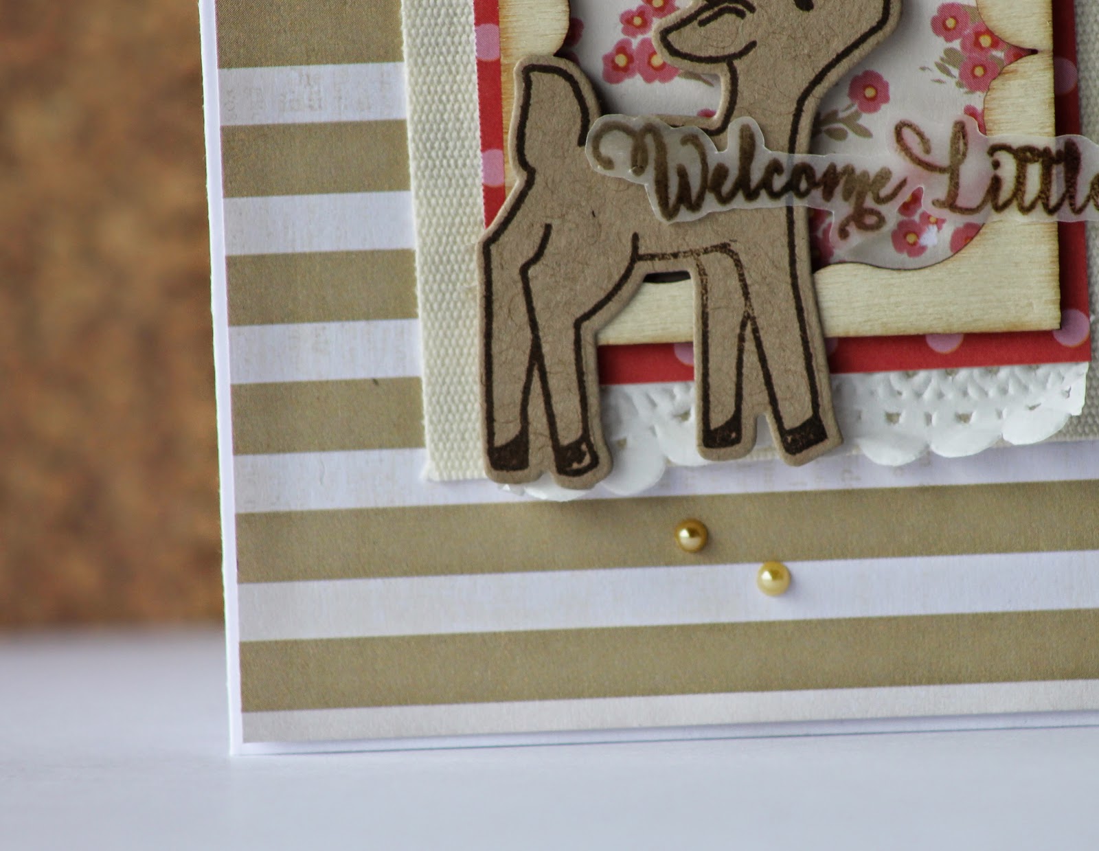
For this card, I knew I wanted to use the sweet little fawn from Avery Elle's Storybook stamp set, so I first stamped that, die cut it, and began to arrange everything around it.


Before I pulled all the elements of the focal point together, I found a piece of patterned paper that worked well with the fawn. The striped paper from the Dear Lizzy Lucky Charm 6x6 paper pad worked very well, because when I do layered cards, I usually try to make sure the largest piece of paper that is exposed on the card is a basic, lighter feel.

If you use a very busy pattern as the main paper, then it tends to distract from your focal point, so for the busier patterns, I use smaller pieces of and tend to concentrate them in one spot. Using papers from one company or paper pad usually makes it easier to make sure the layered papers flow together well.


Once I had my patterns picked out, I looked for textures.
On the focal point, I started with a piece of fabric that was a tag on a pair of pants in its previous life. Then I slipped a light piece of doily underneath the smaller, layered busy patterns, to lighten them up.
I used a wood veneer frame to set the stage for the fawn, and once the fawn was placed, I added some orange butterflies and pearls to add a pop of color to the card.


To make sure the card didn't get too heavy, I embossed the sentiment on vellum and cut it out for an airy feel.

Thanks so much for sticking through this long post, and thanks to Virginia for inviting me! Head over to the challenge blog to see all the amazing entries, and play along for a chance to win a Simon Says Stamp $25 gift card!

*****************************************

4.06.2015

Watercolor Wreath // Avery Elle

Christ is risen! Alleluia! I hope you all had a beautiful Easter!
I'm just popping in today with a quick card for the AEI{heart}U challenge...


This was a pretty quick and easy card - I simply stamped the sentiment and smaller images from the Storybook stamp set in a wreath shape, then brushed over it all with some green Tattered Angels mist. I stamped and die cut the fawn and butterfly, colored then, and popped them up on the card base behind a black circle die cut.

Thanks for stopping in and have a wonderful day!

***************************************
Not shown: PTI "Rustic Wreath" 

4.01.2015

Embossed Handwriting // Crate Paper

Just stopping in real quick with a real quick card, featuring some embossed handwriting.


If you've made cards with gold or silver on them, then you know how hard the darn projects are to take pictures of! For this card, I took some Maggie Holmes paper that I wanted to shine, and used a Versamark pen to write the sentiment out. Fortunately for me, this rather messy scripty style is, well, stylish right now, so I didn't bother with being perfectionist about it.
I embossed everything with gold embossing powder, then after the embossing had cooled, I went over it again with the Versamark pen, just because the coverage wasn't as defined as I wanted. You could probably use some thicker embossing powder and be fine with embossing just once.

Anyways, thanks for stopping in and have a beautiful day!

*******************************************


Supplies not shown
Cardstock: Papertrey Ink Classic Kraft
Gems: Darice
Embossing powder: Hampton Art