The weather just has the darndest sense of time, doesn't it? The two practices we have this month; canceled because of SNOW!
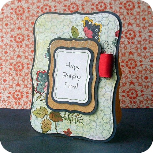
On a happier, more colorful note, I made this cheery little birthday card for Little Red Wagon, 365 cards, Incy Wincy Designs, Cupcake Craft challenges, Dutch Dare challenge (made my own sentiment), and HFOS, ...
a)
b)
Better a) or b) ?
I messed with the background because I was suddenly infuriated how some people can add the beautiful backgrounds and I couldn't. So I decided, in my temporary state of madness, to add some coordinating paper to the background....I don't know if it's too distracting though - I need someone else's opinion, so, what do you think?
And I apologize if you're getting sick of seeing these Nesties - I'm just having TOO much fun with them!
Thanks for stopping by! :)
***********
Happy Birthday, Friend recipe
Cardstock: Bazzil, SU!
Patterned paper: Basic Grey "June Bug",
Sentiment: Printed: font from Kevin&Amanda
Ribbon: unknown
Other: Sakura pen


That a very beautiful card!
ReplyDeletewow this is a very pretty card....
ReplyDeleteWhat a pretty card. The image is adorable and the paper is gorgeous. Thanks for joining us at cupcake craft challenge and don't forget our new challenge starts on 4th Jan!. Hugs, Denise x
ReplyDeleteGorgeous Clare! I love the white background but I'm big on no distractions.
ReplyDeleteI like the background paper--I think it often works to highlight and compliment your design. Love the patterened paper on this card too.
ReplyDeleteOh wow, I totally love it! It is beautiful!
ReplyDeleteThanks so much for playing with us at LRW!
Fantastic card Clare and just perfect for our celebration theme, such a pretty choice of papers and lush ribbon! Thanks for playing along with us at Cupcake :) Donna x
ReplyDeleteI love the card and like you, love playing with those nestabilities :-) I prefer option b without background paper, it doesn't distract from your card. Happy New Year, Petra.
ReplyDeleteLOve your card! Great way to add the sentiment like this in a nestie-shape (never get tired of those LOL)
ReplyDeleteAbout your background: I do think (a) looks more "alive". If you are disturbed by a too dominating background paper, try to add more depth between picture and background, so the background will turn a little more blurry (a little more distance between card and background and focus on card as you take the picture for instance)or just try a not too shouting background.
Thanks for joining us at DDCC.
Please do come back for tomorrows challenge!
xx Monica
Very pretty card! Great use of the floral paper and the nesties! Thanks for joining us at Little Red Wagon again this week! And I think I prefer the simpler background, I've been using a dark background which seems to work for me although I tend to make lighter cards.
ReplyDeleteThis is so pretty :)
ReplyDeleteWith this particular card I think that the colourful background brings out the colours in the card. Some can be too distracting though, so I think it depends on the card at the time (yeah I know I didnt help much huh!!)
Thank you for joining us over at Incy Wincy Designs Challenge
Have a Happy New Year!!
beautiful card Clare, i love the first background on this one. It just makes the card pop!!! Have a Happy New Year!! hugs
ReplyDeleteI just adore this card!
ReplyDeleteMy opinion on the backgrounds... while I think that the patterned paper does make the card pop, I prefer a standard solid color for the background, so as to not distract from the beauty of your card. It doesn't always have to be white, but at least a solid color is my preference.
Wow, this is beautiful!!! Love the background!!! Thanks so much for playing along with HFOS.
ReplyDeleteTrish
oh this is gojus so great to see a differnet shaped card great papers too thanks for joining us at incy designs this week love cheryl xxxxx
ReplyDeletea.
ReplyDeleteGreat cards girl!!!